
Designing a Logo That Honors Craftsmanship

The Challenge
The challenge was creating a logo that captured two seemingly opposing qualities at once. The name “The 5 and Dime” naturally evokes an old-school, vintage feel tied to antiques and history, while the company's work brings those pieces forward with modern artistry and design. The logo needed to respect the character and nostalgia of restored furniture while clearly signaling that this was not traditional restoration, but thoughtful upcycling with a contemporary edge. Balancing classic charm with modern expression—while aligning with the tagline upcycled furniture, antiques and accents—was essential to accurately reflect the brand's identity and creative vision.
Our Process & Approach
Our process focused on collaboration and careful exploration to meet the client’s high standard for artistic quality. Through detailed discussions, we explored a wide range of visual directions, typography styles, and design elements to understand what best represented their vision. Each option was thoughtfully considered, weighing how well it balanced vintage character with modern refinement. By working closely with the client at every step, we were able to narrow in on a direction that felt authentic to their craft and aligned with the level of care and creativity they bring to every piece they restore.
The Solution
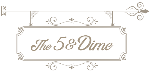
The final solution was a logo that the client felt fully confident standing behind. The design reflects the look and feel of an early-1900s storefront sign, capturing the nostalgic character of the “5 and Dime” name while remaining clean and intentional in its execution. This timeless, old-style aesthetic aligns perfectly with their focus on upcycled furniture, antiques, and artistic accents. The client was thrilled with the result and now uses the logo prominently across social media, apparel, and branding materials, making it a central and recognizable part of their identity.